
Our energy and transportation tracking spreadsheets now calculate equivalent CO2 emissions (metric tons). These numbers feed a chart. This chart can be seen on the home page (postage stamp size – working on changing this) if you scroll down to the “What we are doing and why” section. This chart is updating almost daily.
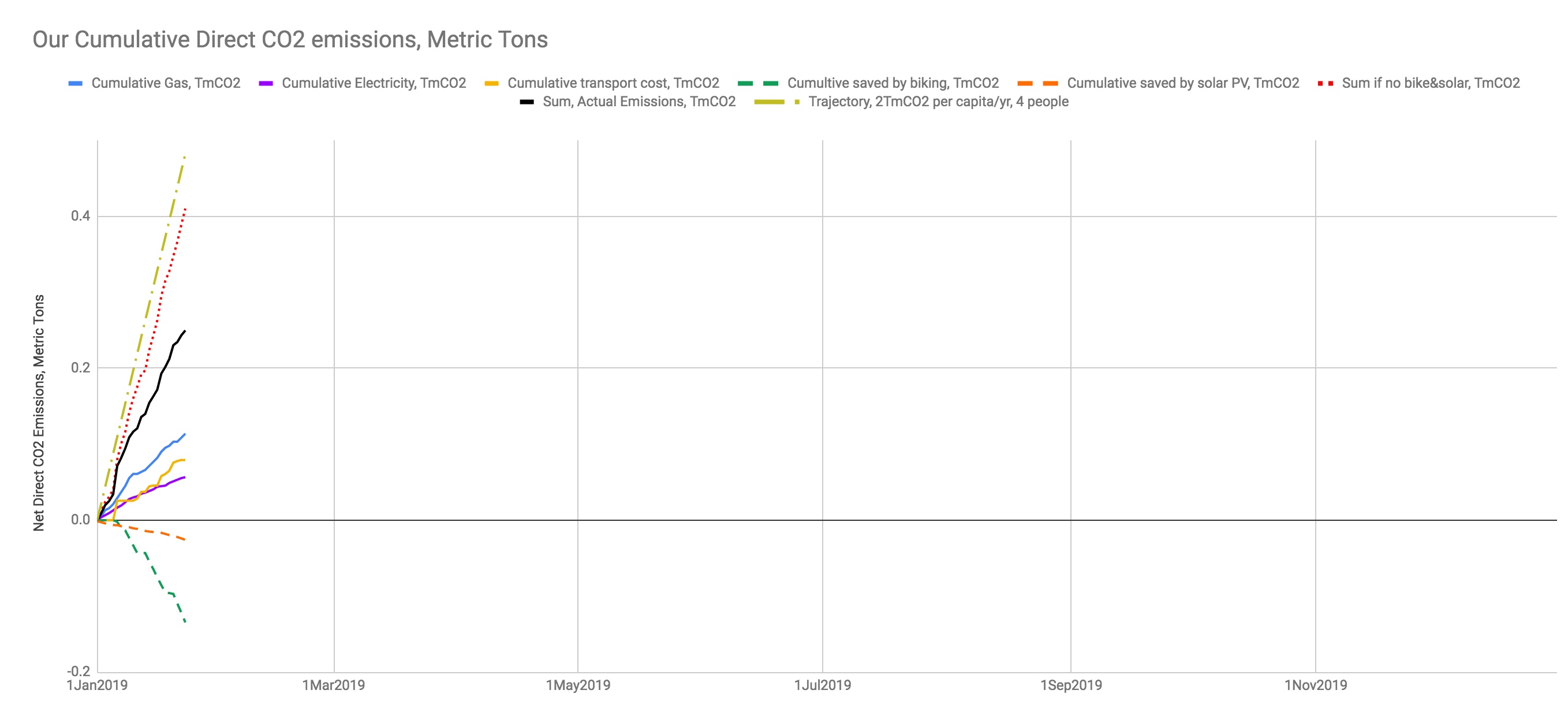
This chart shows our actual energy consumption from electricity and transportation and includes a sum total actual CO2 emission. There are also negative lines for our bike commuting and our solar PV generation. The chart has a dotted red line which shows what our emissions would be if we were not generating some electricity and were not displacing car trips by biking. For reference, I’ve added a target line which is 2.0TmCO2 per capita per year, turned into a daily emission allowance.
The next project is to add out food consumption CO2 footprint to this chart.